The iPhone 6 Review
by Joshua Ho, Brandon Chester, Chris Heinonen & Ryan Smith on September 30, 2014 8:01 AM EST- Posted in
- Smartphones
- Apple
- Mobile
- iPhone 6
With every launch of the iPhone, Apple seems to have everything to lose and not much to gain. Apple’s iPhone line accounts for the majority of profits in the smartphone space, and as the smartphone market marches towards maturity it seems inevitable that companies like Xiaomi will be able to deliver largely similar experiences at much lower prices. The same once happened with Apple in the days of the PC industry where Apple approached irrelevance. Yet generation after generation, Apple seems to be able to hold on to a majority of profit share, and they’ve managed to tenaciously hold on to their first-mover advantage.
This brings us to the iPhone 6. This is now the eighth generation of the iPhone, and the fifth generation of the iPhone’s industrial and material design. We should note right now that this review is specifically for the iPhone 6; for the iPhone 6 Plus, please see our iPhone 6 Plus companion review. At this point, it’s not really possible to revolutionize the smartphone, and on the surface, the iPhone 6 seems to be directly inspired by the iPod Touch. However, instead of the chamfered edge where the display meets the metal unibody we see a continuous curve from the sloping glass to the metal unibody that looks and feels great. While the M8 was one of the best phones for in-hand feel, the iPhone 6 goes a step further due to the reduced weight and rounded side. I've always felt like the HTC 8X had one of the most compelling shapes for a phone, and the incredibly thin feel of the iPhone 6 definitely reminds me of that.
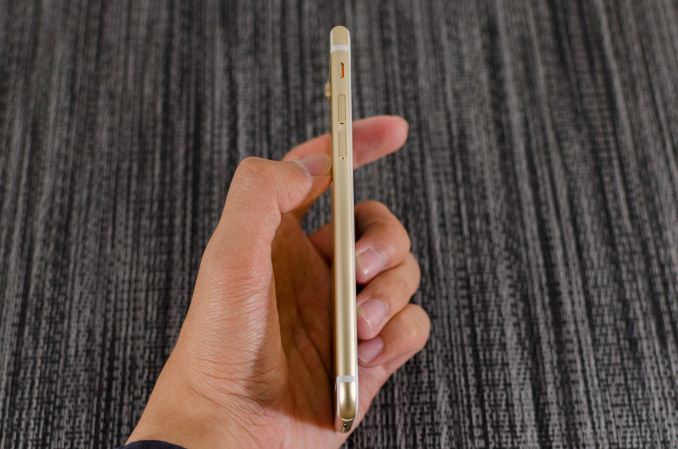
Along the left side, we see the standard volume buttons and mute switch that continue to have the same solid feel and clean clicking action. As I discuss in the iPhone 6 Plus review, going by Consumer Reports' data it seems that there is a weak point near the bottom of the volume rocker, although it's far less likely to be an issue on the iPhone 6 due to its smaller size. Along the top, there isn’t a power button because it’s been moved to the right side of the phone so there’s nothing notable on the top.
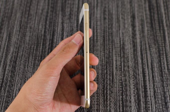
On the right side, we see the previously mentioned power button and also the SIM tray, which is ejected by inserting a pin into the eject hole. Similarly to the volume buttons, the power button has a solid feel that gives a distinct click when triggered and continues to be quite unique when compared to phones other than recent iPhones.
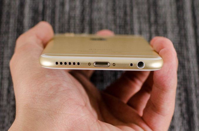
The bottom has the Lightning connector, speaker, a microphone, and 3.5mm headset jack. The placement and design of all these elements are largely similar if not shared directly with the iPod Touch.
The back of the phone continues to share elements from the iPod Touch. The camera, microphone, and LED flash are almost identical in their appearance, even down to the camera hump’s design. The LED flash does look different to accommodate the second amber flash, but the shape is identical. The only real difference is that the antennas of the iPhone 6 are the metal pieces on the top and bottom, with the associated plastic lines instead of a plastic RF window.
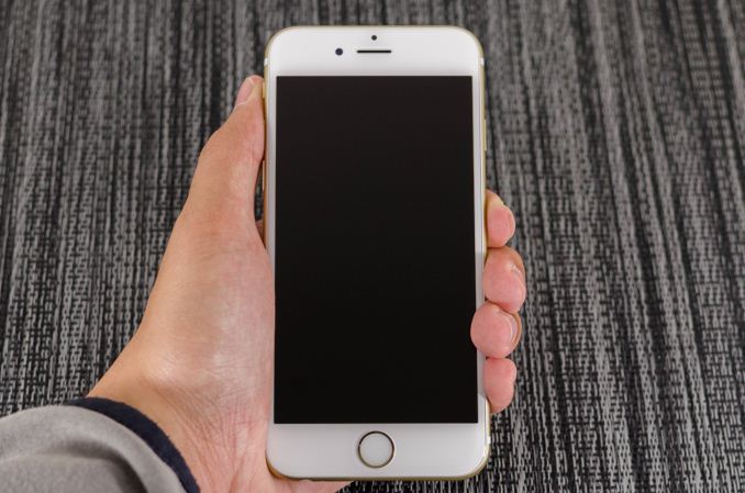
The front of the phone is decidedly more similar to the iPhone 5s though, with the Touch ID home button. While the earpiece hasn’t moved, it seems that the front facing camera has been moved back to the left side of the earpiece, and the sensors for light and proximity are now above the earpiece. For the most part, there’s not much to comment on here but after using the iPhone 6 for an extended amount of time I’m definitely sure that the home button is relatively closer to the surface of the display glass than before. In addition, the home button has a dramatically improved feel, with short travel, clean actuation, and a reassuring click in most cases.
Overall, while I was undecided at the launch of the iPhone 6 I definitely think the look of the new iPhone has grown on me. The camera hump’s accent serves as an interesting design touch, and the feel of the design is definitely much more comfortable and ergonomic than before. I’m not really sure that the extra reduction in thickness was necessary, but it does make for a better first impression. In the launch article I was a bit surprised that Apple chose to have a camera hump but given the fact that the iPod Touch has the same design it seems that there is precedent for such a move. I personally feel that the design wouldn’t be worse by increasing thickness to eliminate the hump and improve battery life as a result.
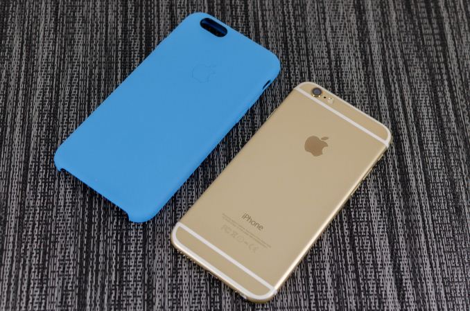
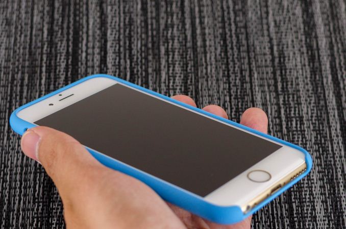
Apple has also introduced a new silicone case, which brings a lower price point than the leather cases. Surprisingly, this is a rather high quality case, and as far as I can tell it doesn’t carry any of the issues that silicone cases traditionally have. There’s a nice lip to make sure that the display glass doesn’t touch a surface if the phone is put face down, and the material doesn’t seem to stretch or attract pocket lint the way most silicone cases do.
There’s definitely a lot more to talk about though, and to get a sense of the major differences I’ve put together our usual spec table below.
| Apple iPhone 5s | Apple iPhone 6 | Apple iPhone 6 Plus | |
| SoC | Apple A7 | Apple A8 | Apple A8 |
| Display | 4-inch 1136 x 640 LCD | 4.7-inch 1334 x 750 LCD | 5.5-inch 1920 x 1080 LCD |
| WiFi | 2.4/5GHz 802.11a/b/g/n, BT 4.0 | 2.4/5GHz 802.11a/b/g/n/ac, single stream, BT 4.0, NFC | |
| Storage | 16GB/32GB/64GB | 16GB/64GB/128GB | 16GB/64GB/128GB |
| I/O | Lightning connector, 3.5mm headset | ||
| Size / Mass | 123.8 x 58.6 x 7.6 mm, 112 grams | 138.1 x 67 x 6.9 mm, 129 grams | 158.1 x 77.8 x 7.1 mm, 172 grams |
| Camera |
8MP iSight with 1.5µm pixels Rear Facing + True Tone Flash 1.2MP f/2.4 Front Facing |
8MP iSight with 1.5µm pixels Rear Facing + True Tone Flash 1.2MP f/2.2 Front Facing |
8MP iSight with 1.5µm pixels Rear Facing + True Tone Flash + OIS 1.2MP f/2.2 Front Facing |
| Price | $99 (16GB), $149 (32GB) on 2 year contract | $199 (16GB), $299 (64GB), $399 (128GB) on 2 year contract | $299 (16GB), $399 (64GB), $499 (128GB) on 2 year contract |
As you can see, this is a major release even at a high level. While the design might take some inspiration from the iPod Touch, the hardware is a completely different beast. There’s a new SoC, the A8; the iPhone 6 also includes a bigger and better display, newer WiFi module, bigger battery, and a better camera. Of course, there’s a lot more to the story of the iPhone 6 than a spec sheet. The first major difference that we’ll talk about is the SoC.




531 Comments
View All Comments
akdj - Friday, October 3, 2014 - link
Who uses their smartphone to sit and look at the UI? Or. Thats right. You. Can't find any apps that'll work? I'm on my springboard for a second or three. Like you said, pull down, enter the first letter or two of the software/app I'm going to use and click, it's open!No more just looking at the 'floating (?) blobs that sit in rows (like Android)non a screen. Designed for teenagers, grandmas, commercial and military pilots. Military operations you're clueless about and 95% of the Fortune 500 companies have deployed iOS.
And unfortunately for you, if you're NOT an iOS user, I completely 'get it'. I've got both an iPhone 5s and Note 3. Love em both but the Note is a tool for a very specific job I so that uses the SPen to do some amazing stuff that wouldn't be as 'cool' as on graph paper. Other than that, I don't care the app you name, Id it's in parity with iOS, I GUARANTEED iOS runs circles around the Android port. As well the optomized tablet apps are overwhelmingly in favor of iOS, and the biggest challenge with the the Note in different apps I've noticed. They're apps designed for 4.3-4.7" displays and the developers aren't tsking the time to 're-do' their tab apps. They're just blown up leaving a load of white space, sparse UI and pretty lame performance as they're not yet 'coding' to take advantage of multiple core computing. Nearly EVERY app in either environment runs on a single core.
Mind blowing though you've spent that much time looking at 'blobs' and haven't figured out that IF you TOUCH the 'blob' something really REALLY Cool might just happen!
Go ahead. You won't break it
J
steven75 - Tuesday, September 30, 2014 - link
Smaller phones tend to be cheaper? The rest cost the same? No, a single part like the display could be cheaper, but there are very real costs to miniaturization.Samsung phones not only look cheap because of the plastic, they feel cheap in hand as well. It's not the material--It's what Samsung does with it. Nokia for instance makes some plastic phones that look good and feel great. Samsung comes out with phones that look like band-aids and have fake leather stitching molded into them.
danbob999 - Tuesday, September 30, 2014 - link
There you go. Samsung phones are not cheap. You *think* they *feel* cheap. That's your opinion and not based on any fact. Whether a phone is cheap has nothing to do with look or feel.And yes, smaller phones ARE cheaper. The iPhone 6 Plus is more expensive to make. The A8 SoC and all other chips are not smaller in the iPhone 6 so there is no additional miniaturization. Only the display and the battery are smaller, and both are cheaper. iFixit teardowns have shown for years that Galaxy S-series are most expensive to make than iPhones.
mrochester - Tuesday, September 30, 2014 - link
Doesn't that mean Apple did a good thing? To make a product like the iPhone for less than it costs Samsung to make their Galaxy devices sounds like a big win to me.danbob999 - Tuesday, September 30, 2014 - link
Of course it is a win for Apple and their shareholders. Not for their customers.Of course it is cheaper to put half the RAM, a small display and a small battery.
bigstrudel - Tuesday, September 30, 2014 - link
RAM has power costs idiot. It's not worth it just so lazy people don't have to close tabs.You must've missed the part where they tested that 1800mah battery and it beat up on devices with 50% more juice.
danbob999 - Tuesday, September 30, 2014 - link
I am not saying the iPhone is a bad device.But don't call cheap a phone with more expensive components juste because the shell is in plastic. That's all I am saying.
mrochester - Tuesday, September 30, 2014 - link
I think the expression was relating to the device feeling cheap in the hand, not the actual BOM.danbob999 - Tuesday, September 30, 2014 - link
@mrochesterIs this a tech site or a teenager fashion magazine? Why would anyone care about how cheap it feels in the hand as long as it is a good device?
A metal enclosure with no electronics in it may not feel cheap in the hand but it would be useless. What matters is inside.
Hemlocke - Tuesday, September 30, 2014 - link
Not true, even in the slightest. The thermal envelope on a material with superior heat-dissipating properties, like 6003 aluminum, versus that of a polycarbonate device, with a poor thermal envelope, is important.Having superior heat-dissipating properties means your components can operate at capacity longer, and they also last longer. All you need to do is look at throttling on the S5, compared to the HTC One M8, and you can see a huge difference in extended performance.