First Impressions and Hands On of Android L
by Joshua Ho on June 26, 2014 6:40 PM EST- Posted in
- Smartphones
- Mobile
- Laptops
- Android L
Today, Google finally posted the system images for Android L on the Nexus 5 and 7, so I decided to take a look at them to see what’s going on. After flashing the images through fastboot, the first thing I noticed was just how much longer it takes to get past the first startup. This is definitely a significant departure from the Dalvik era, as the ahead of time compilation process happens on the first boot for system applications. There’s also a new boot animation that is a modification of the KitKat boot animations. The best description I can give is that the colors now orbit each other like electrons.
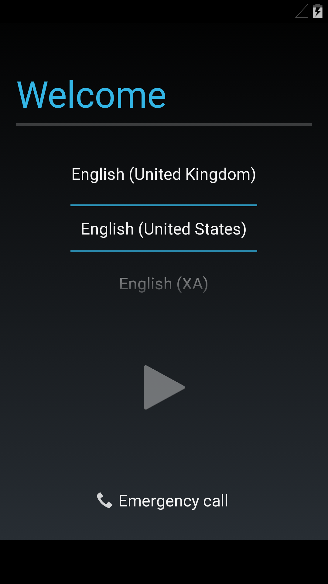
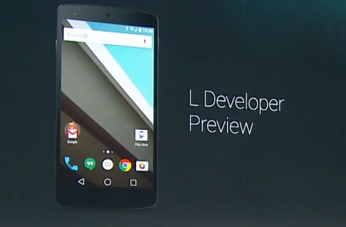
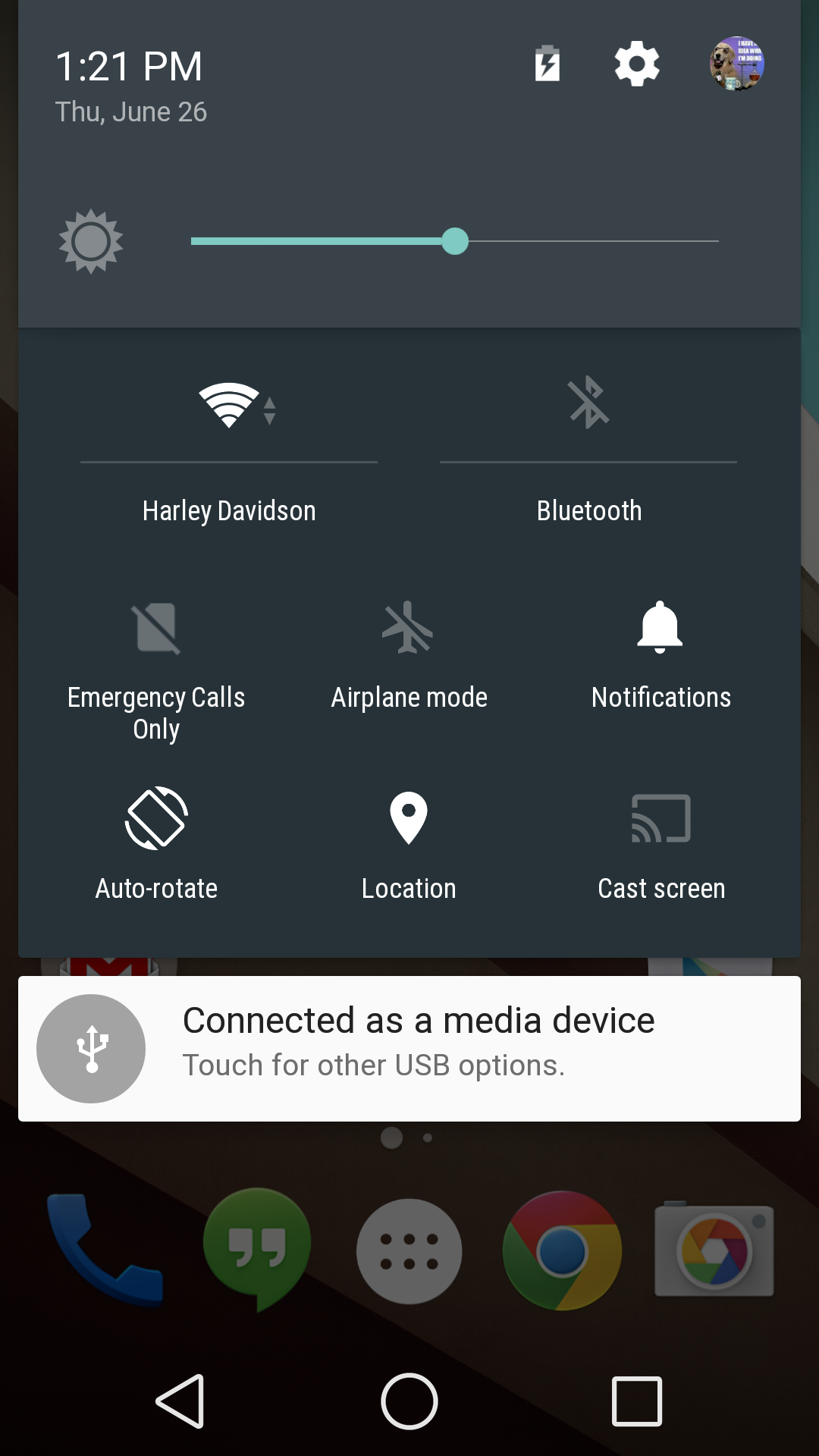
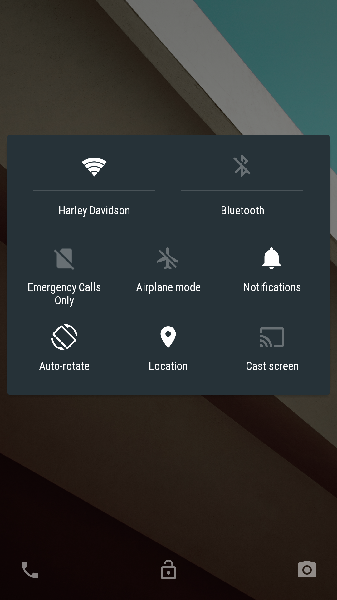
After booting, the setup process remains mostly unchanged from 4.4. Things definitely start to change once you get into the main UI though. While it’s hard to show some of the animations, there’s definitely a great deal more depth to the UI than before. One of the first things that I noticed was the change in the notification drawer. Now, instead of tapping a button to get to the quick settings, it’s just another swipe down to view that panel. It definitely has a sense of depth as well, as the icons seem to scroll out underneath the notification panel.
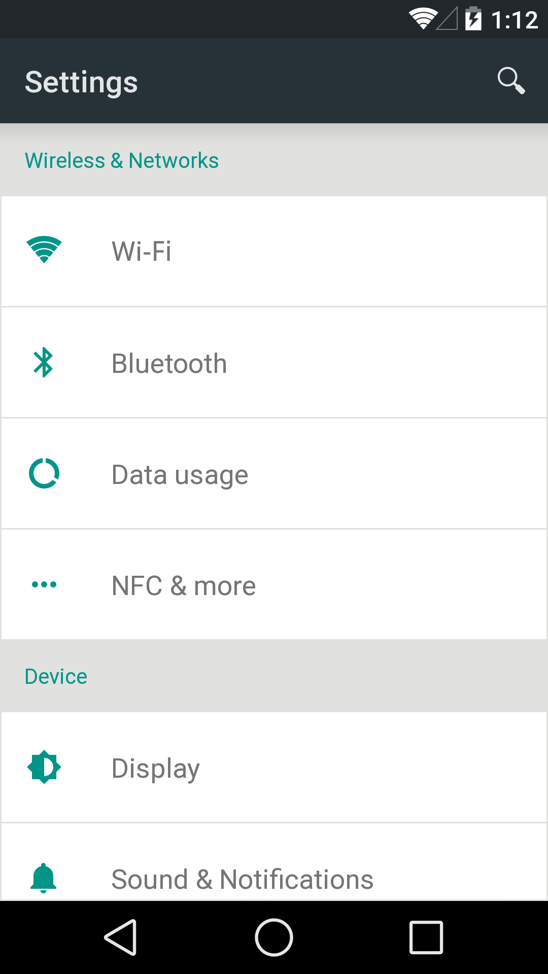
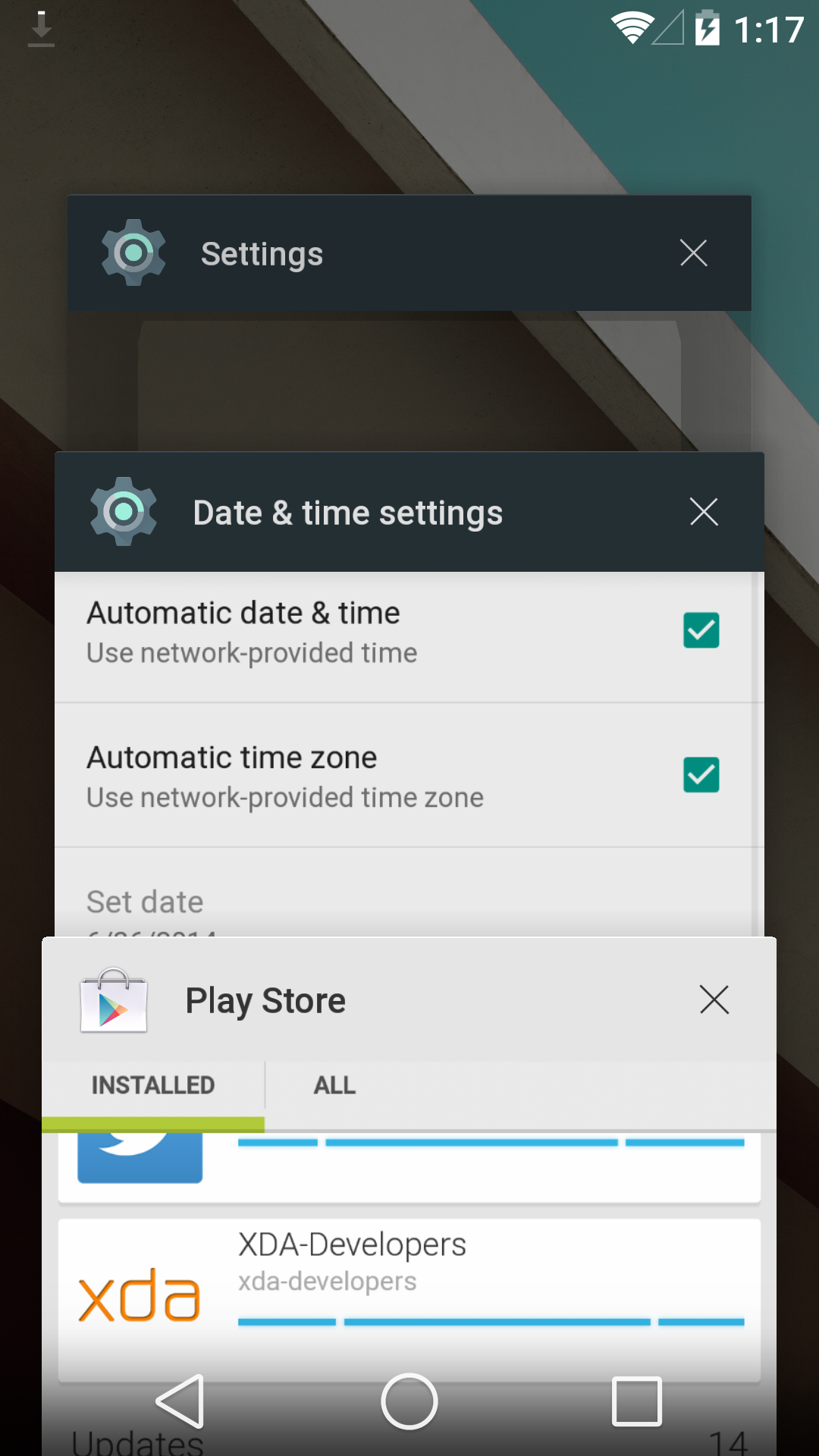
Once you actually go into the settings menus, things start to look very different. The old menu still remained rather dark in its design, but the new menu uses a white backdrop for a lighter feel. In general, it feels very much like Sense 6 in this regard. There’s also a new landscape view to increase information density when compared to previous versions. The new overscroll animations are also much more reactive than before, and the shape of the overscroll varies based upon where your finger is. This same reactive animation behavior can be seen throughout the UI now.

It seems that the most consistent motif in this preview release is responsiveness, and not just in animations. For one, scrolling through a listview is the smoothest experience I’ve ever had in Android, bar none. It’s strange that I’ve come to expect this, but trying to scroll through a long comment thread in a Reddit client before caused pauses and stutters without fail. The same is no longer true in this build on the Nexus 5. Scrolling through a ~700 comment thread happens with no perceivable stutter. It’s still possible to get the device to choke though, and the Play Store home page still seems to have some stutters and pauses while scrolling. It’s definitely smoother than doing the same on the One (M8).


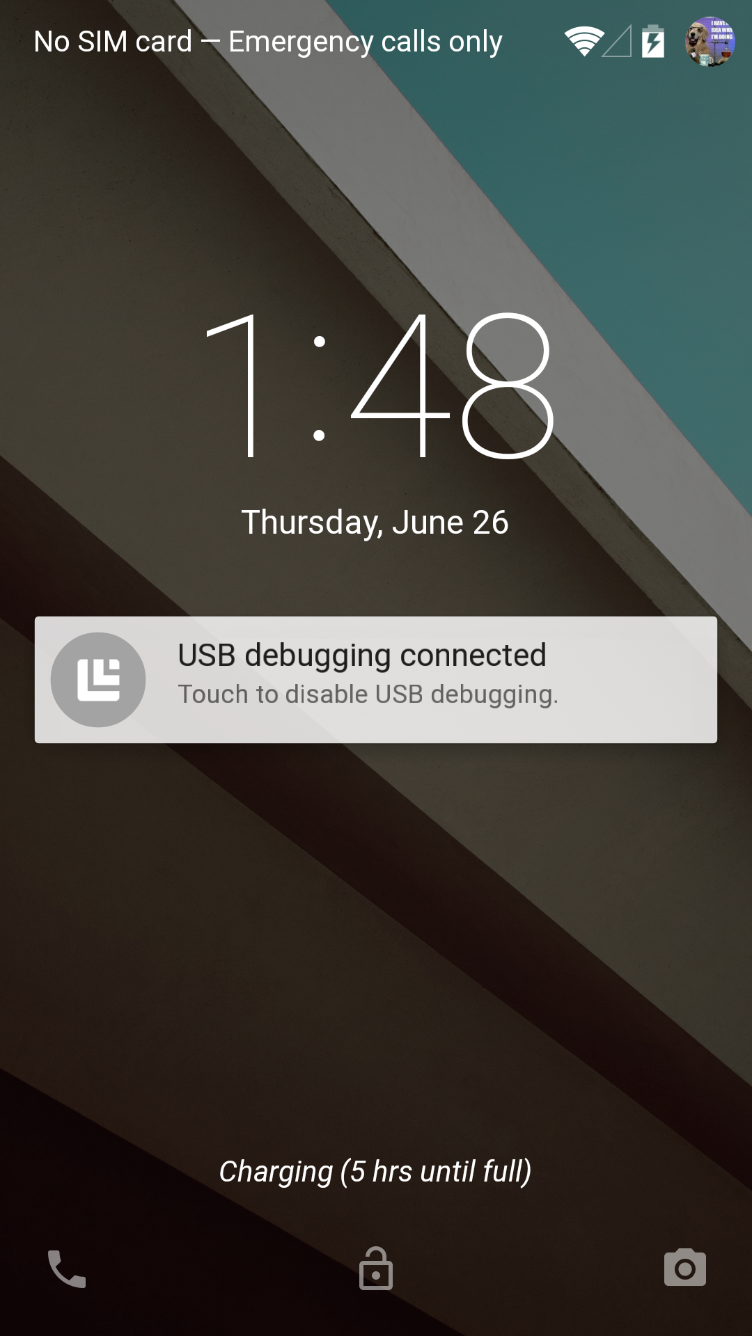
There are also changes to the lockscreen. For now, it seems that lockscreen widgets are gone. The new lockscreen also adds an iOS-style notification display, which is definitely a useful feature. Swiping away these notifications is relatively simple as well. Swiping right on the lockscreen now brings up the phone application, and swiping left brings up the camera application as always. I did notice a bit of bugginess, as swiping down on the lockscreen seems to hide both the clock widget and notification bar with no way to get it back unless you unlock the phone. Swiping down from this state brings down the quick settings, but it’s no longer attached to the notification drawer. Also, it seems that there’s some sort of charge estimation display now, as on the lock screen it displayed the time left until the phone was fully charged.
The new multitasking UI is also surprisingly usable. In this regard I think the information density has been increased, as it’s theoretically possible to show up to four application tiles at one time instead of the three that used to be shown. The same use of depth is also helpful in this design, as it help to establish a sense of chronology that wasn’t quite there with the old multitasking UI. Here, scrolling through even the longest of histories is flawlessly smooth and without pauses. As always, apps can be closed by swiping left or right to remove them from the multitasking UI.
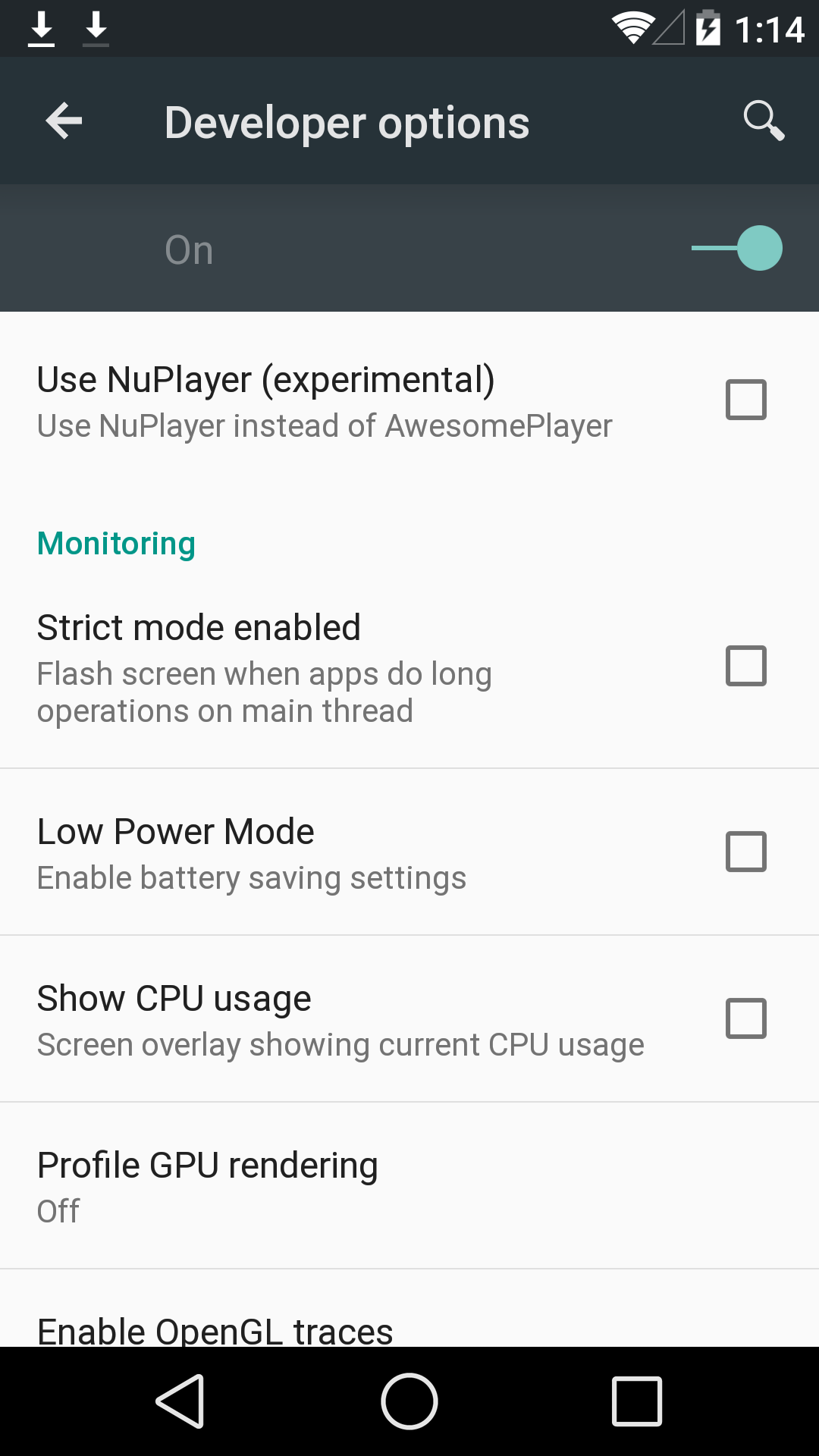

Going through the settings and digging a bit deeper, I’ve managed to find some information about this build. Based upon the build.prop, this release seems to be quite new as it was built on June 18th, just a week before the keynote. There are also some new settings in the developer options menu, such as WiFi verbose logging, simulated color space, and a NuPlayer option.


Overall, I’m quite excited to see how Android L turns out by the time a release OTA rolls around. The only real issue I have at this point is that some UI elements such as the clear all notifications button have disappeared with this build. I suspect that this version of Android will be a significant change unlike the updates from 4.2 to 4.4. With any luck we’ll be able to track the changes between each preview release to see how Android L evolves until its release in the fall.
Edit: Just a quick note about the power saver function. Based on what I can immediately observe, brightness is decreased. The governor seems to be a bit more reluctant to reach maximum clock as well, and seems to prefer using 720 MHz even though the max is 960 MHz.


63 Comments
View All Comments
Spunjji - Monday, June 30, 2014 - link
You mean like this:https://play.google.com/store/apps/details?id=com....
Or like the Moto X has. I'm sure it's not the only Android phone with that feature, just the most recent.
Impulses - Friday, June 27, 2014 - link
"The new multitasking UI is also surprisingly usable. In this regard I think the information density has been increased, as it’s theoretically possible to show up to four application tiles at one time instead of the three that used to be shown."Huh? Is that in addition to the app you were in or what? When I press the app switcher button on my Nexus 5 I see four app thumbnails, well, three and most of a fourth (4/5ths of it?). I also find it easier to tap thru in a hurry than that pseudo 3D tab switcher from Chrome, which this new app switcher imitates (I think). Not a big deal either way, it's just kinda odd they're going to a more graphic intensive switcher (while Sense has gone the opposite way).
phoenix_rizzen - Monday, June 30, 2014 - link
Depends on your DPI settings. ;)With a DPI of 400 on an LG G2 (the N5's big brother) the Recents panel shows 4 full screens, and a smidge of a 5th.
However, the big difference between the old and the new Recents is how much of the app screen is shown. The old Recents shows the app's full screen; the new Recents only shows the top half or so of the app's screen.
So, you go from 4 full screens to 1 half screen + 2 smaller screens. Yeah, that's an improvement. :roll-eyes:
jimv1983 - Friday, June 27, 2014 - link
I don't like the removal of lock screen widgets, the removal of battery status in quick settings or the white color that replaces the old gray in the settings.jimv1983 - Friday, June 27, 2014 - link
What is up with the new keyboard? There is not indication of where one key ends and the next begins. No separation between them.reggjoo1 - Friday, June 27, 2014 - link
Will it have a low footprint, like kitkat? I wonder if it will be installed on mid range, to budget devices.coburn_c - Friday, June 27, 2014 - link
Wow those new buttons are ugly. Actually the whole thing is kind of ugly.AEdouard - Saturday, June 28, 2014 - link
I wish they would drop the blue color in menus. Just go all white. Cleaner.martixy - Sunday, June 29, 2014 - link
I've been on ART since 4.4.2 or something and initial startup and then migration to 4.4.3 and 4.4.4 took FOREEEEVER. So yea, it's definitely noticeable.And I have yet to discover any issues, including in apps that require root.
The most relevant issue however is of course: Are we getting Android Licorice or something else?
dwade123 - Monday, June 30, 2014 - link
Still so ugly doe.