Revisiting The OnePlus 3: sRGB, Memory Management, & More
by Brandon Chester on June 30, 2016 3:00 PM EST- Posted in
- Smartphones
- OnePlus
- OnePlus 3
Last week I published my review of the OnePlus 3. I reviewed the OnePlus 2 for AnandTech, and given that the OnePlus 2 had many problems it seemed appropriate that I should examine the improvements that OnePlus made with their latest smartphone. As I used the phone, I was glad to see that OnePlus had clearly taken feedback from the reviews of the OnePlus 2 to heart and spent the year since then working on creating a truly great phone. From the chassis, to the camera, to the SoC, the OnePlus 3 really delivered a level of quality comparable to phones that cost significantly more.
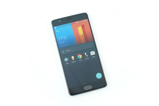
There was one exception to this trend, which was the OnePlus 3's display. The OnePlus One shipped with a 5.5" 1080p IPS display, and it clearly aimed to accurately render content targeting the sRGB color space, which applies to essentially all content that you'll see on a smartphone. With the OnePlus 2 things weren't so great. OnePlus still used a 5.5" 1080p IPS display, but there was essentially no effort put into calibrating the display. As for the OnePlus 3, it marked a shift from IPS LCD displays to AMOLED displays in OnePlus's flagship smartphones, and this was to be expected based on the launch of the OnePlus X which sports a 5" 1080p AMOLED display.
The move to AMOLED doesn't come with any inherent issues, but there are things that a manufacturer needs to keep in mind. Without any sort of brightness boost mode the display can be more difficult to use outdoors than competing LCDs, due to AMOLED displays typically capping at 300-400 nits when setting brightness manually. Sharpness is also another factor to consider. The use of the PenTile subpixel arrangement reduces effective resolution, especially when rendering areas of solid color. It also has a negative impact on the rendition of text and other glyphs, as you're not dealing with subpixels aligned in a perfect grid of vertical and horizontal lines. This is why I've advocated for remaining at 1080p when using standard RGB displays but moving to 1440p for PenTile displays. In fact, the red/blue resolution on a 1440p PenTile display is still slightly lower than that of a 1080p RGB display, but that's another topic.
The last thing vendors need to keep in mind about AMOLED displays is that, while they can offer a much greater color gamut than your typical WLED-backlit LCD, without color management this will cause distortions in all content you view on the display. For this reason it's important to offer an sRGB color mode which constrains the display so that it matches the color standard used by essentially all content. Unfortunately, the OnePlus 3 omitted such a feature, which is why it ended up performing so poorly in my display testing.
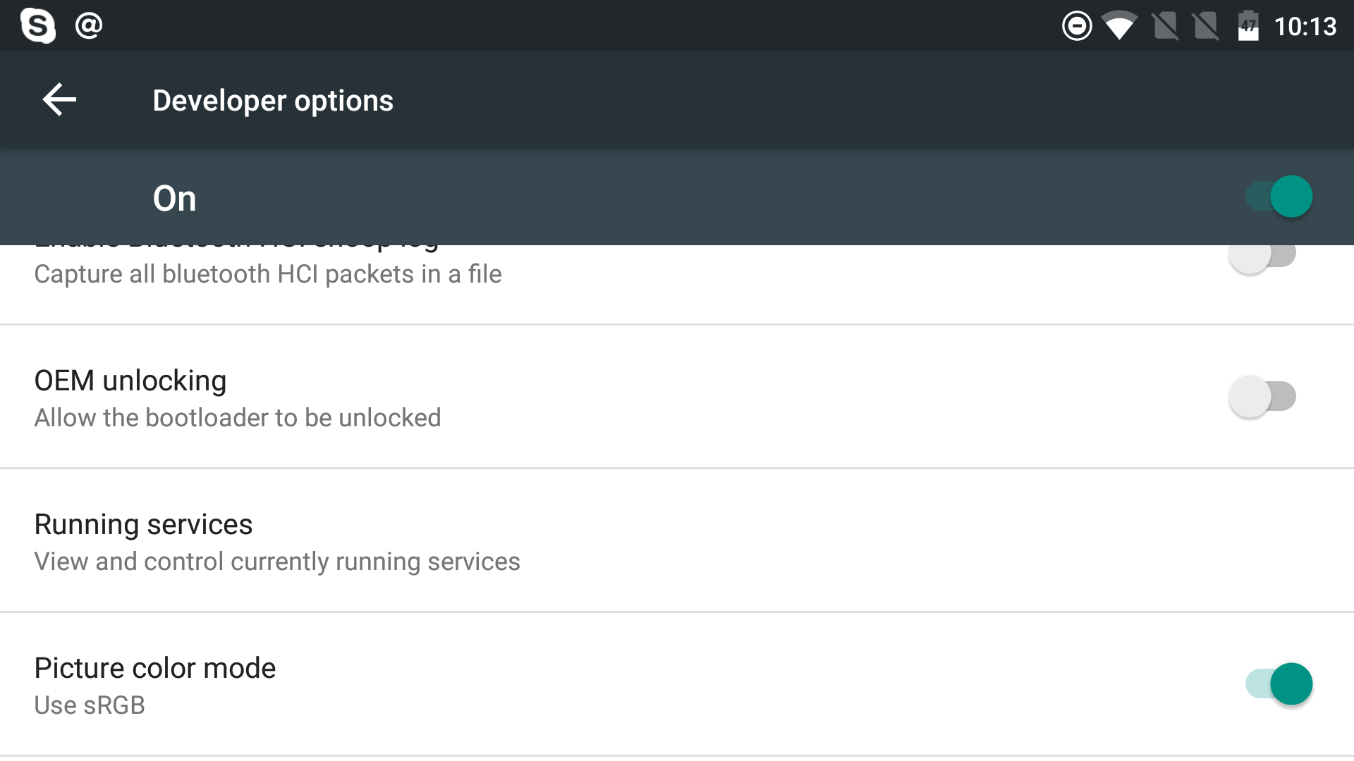
The display section of my review spawned a great deal of debate, and I'll get into that more on the next page. To sum things up, OnePlus was quickly able to ship a preliminary update to review units which added an sRGB mode in the phone's developer settings. Right now this setting resets upon a reboot, but OnePlus says that it will keep its state between reboots when the stable firmware goes out to all devices. With OnePlus making an effort to correct what I felt was the biggest issue with the OnePlus 3, I thought it only made sense to revisit the display and run it through the tests again to see just what sort of changes have been made, and whether they improve the OnePlus 3's standing among smartphones.
A quick word on memory management:
Before discussing the changes that OnePlus has made to the display, I did want to comment on one of the other controversial aspects about the OnePlus 3. I only mentioned this once in my review, but the OnePlus 3's memory management on its original firmware is quite aggressive about evicting apps from memory, which led many people to wonder why OnePlus had included 6GB of RAM if you couldn't use it. With the beta update that they've sent to review units one of the patch notes states that this behavior has been tweaked somewhat. While I'm not able to do any in-depth comparisons due to the fact that I'm now stuck on this firmware, I did want to mention that app eviction seems to be less aggressive. In my admittedly not very scientific testing I was able to have Chrome with three tabs loaded, Twitter, Hangouts, Dropbox, Google Drive, Gmail, Skype, the Files app, and Google Photos all resident in memory at the same time, and none had to recreate their activities upon me returning to them. Pushing any further would honestly be going far outside the set of apps that I use on a daily basis and can keep track of in my mind, and so at least in my view I don't think app eviction is something to worry about on the OnePlus 3 as of this new firmware.
With that out of the way, lets take a look at the new sRGB mode that has been added to the OnePlus 3.


81 Comments
View All Comments
Brandon Chester - Thursday, June 30, 2016 - link
Yes, using our internal search is unfortunately a mistake. I believe it just sends the queries into a black hole. Best to use Google for search :)pillai86 - Thursday, June 30, 2016 - link
Have you noticed that apps like Skype does not remain online and even some apps don't notify when it's pushed to the background? Skype status turns offline!!name99 - Thursday, June 30, 2016 - link
Be careful that you are not confusing two different things."Color Management" and True-Tone solve two (apparently OPPOSITE) problems.
Color Management solves the PROFESSIONAL's problem: I want this content to be captured by a camera here, displayed on a device there, printed on a printer somewhere else, and to look IDENTICAL in all those situations, regardless of the camera, screen, and printer technology.
True-Tone solves the AMATEUR's problem: I want this content to look "optimal" under different lighting conditions. Optimal is a vague sort of word but it is not the same as "identical".
It's kinda like the difference between what a dermatologist wants to see when looking at skin (accuracy!) vs what a fashion photographer wants to see looking at the same skin.
The reason we need the color management is because we need an agreement as to exactly WHAT "240 units of red, 180 units of green, and 27 units of blue" MEANS. This meaning is given in terms of objective physical measurements.
The reason we need the second is that your brain doesn't actually see color in terms of objective physical measurements. This is not obvious --- after all your eye DOES see color that way. But your brain reinterprets the signal the eye sends to it depending on lighting conditions. So the question is --- do you want your visual device to be aware of and compensate for those lighting conditions or not.
And the answer depends on what you are trying to do. If you are trying to "see movies and pictures looking as nice as possible" the answer is "hell yes, compensate"; if you are trying to match colors for whatever professional purpose (even something as simple as shopping for a dress) the answer may range from yes to no depending on the exact purpose, but no is probably the usual situation.
[I do wonder how Apple handles this in terms of shopping for dresses. Has anyone tried this sort of thing? Are the shifts in color from True Tone enough that it would really make a difference?]
stephenbrooks - Thursday, June 30, 2016 - link
I thought the distinction was even simpler than that: do you want colours that are intrinsically luminous (like lightbulbs, stars or fireflies) or colours that reflect the light around them (like paint, ink, most surfaces)?jlabelle2 - Friday, July 1, 2016 - link
Not really. Issue raised by Brandon was about the OnePlus screen targetting a wider gamut screen without propre color managed OS. This resulted in oversaturated colors. ALL the time. Plus, targetting the NTSC color space, they were also completely wrong..Now, TrueTone is not impacting the saturation level, to make it simple, it is shifting the white balance. We cannot say this is intrinsically wrong as there is not one true universal white point value as the external lightning is impacting how we see colors. It derived from the 6500K "standard", that's it.
Still, the impact is very different because you do not end up with fluorescent grass or red carmin tomatoes.
BenSkywalker - Thursday, June 30, 2016 - link
Thank you Brandon, genuinely appreciate the follow up on several different levels. Couple things I wanted to point out following your article-I am not disagreeing with your sentiment *at all*- but would like to point out a bit of a double standard here. You find it a major issue if a person wants calibrated display but can't have it, but not once, not ever, have I heard you lament a sRGB calibrated display for *not* offering a wider color gamut option. In that same vein, I have what was, last time I looked, the best calibrated display for multi use purposes available and out of the two extremely accurate color modes and the one 'Vivid' option- every person I have asked liked the Vivid option the best(*horribly inaccurate*- this is with the option for ARGB or sRGB).
You bring up Apple places a great deal of importance on this matter, along with mentioning they have the highest profits. The Tab S from Samsung beat the iPads pretty easily and were in relative terms a catastrophic failure(in terms of profits vs the iPads). Just saying, calibrated displays are just that.
One final point, and one that I actually think is rather important.
I walked outside the other evening when the sun started getting low on the horizon and, with the utmost sincerity- the first thing that popped in my head was 'it looks like sRGB out here'- yeah yeah, what a geek, whatever. Point being, the location in which you live and the ambient light you are adjusted to will *greatly* impact what you think looks natural. 30 degrees below zero pictures calibrated for sRGB white points look comically bad and insanely unnatural- just as a summer evening picture from Florida calibrated for Japan's NTSC white point would.
One other minor thing, you bashed on the display pretty hard in your first review and I understand the point you were trying to make- but the reality of the situation seems to be that most of your issues had to do with the software the phone was using, outside of the pentile layout which nobody is a big fan of, it doesn't seem you had any issues with the screen. Not criticizing, mainly mentioning that you may want to stress the point in future phone reviews about the problems with the physical display(pentile) versus problems with the software(NTSC color target) that may or may not ever be fixed.
Once again, truly appreciate your follow up, it was a good read and I do greatly admire follow through when there is controversy :)
3DoubleD - Thursday, June 30, 2016 - link
I appreciate your argument that the perception of natural color point is based on an individual's experience and perspective. One who lives in a cold, grey environment versus someone who lives is a warm, tropical environment, will have vastly different perspectives on white point and colors.However, I think this is one of the many cases where the masses need smarter people than them to make the correct decision for them. When you tested your colleagues' color mode preferences, you presented them with a choice of which they prefer, and they gave you their honest answer. This approach to validating usage of technology is fraught with peril though. A stronger metric is what people prefer in daily usage. One test gives an opinion of the moment, another test factors in the gamut (pun intended) of experiences that the person has with the technology.
Now, consider a world where equipment manufacturers abandon sRBG for gamuts of their choosing, each pushing to have their own unique super-wide gamut that they think appeals to their customer base the most. I would argue that in such a world, customers (and businesses/artists/ect) would become frustrated with the inconsistency of how their content is being delivered (as argued by Brandon above). For example, online clothes shopping becomes perilous when the red tie bought ends up not matching... whatever a tie is supposed to match. In many ways, we just came from that world, with displays that notoriously poorly calibrated unless they were professional monitors. Why would we take a step backwards?
I think everyone acknowledges that sRBG is in no way a superior choice, but it is a standard that is widely adopted. Brandon is correct, Android (as all OSes) should be updated to properly manage color spaces to facilitate the transition to wider gamut standards. Apple really led the way here (as much as it pains me to say that).
Great update Brandon, way to hold OnePlus's feet to the fire! A friend of mine received his OnePlus 3 and was also super disappointed with the blue tint, he'll be thrilled to hear it will be fixed.
BenSkywalker - Thursday, June 30, 2016 - link
That, in a nutshell, is the difference between a loyal Apple enthusiast and the rest of the world. Personal choice vs decree from up high.
Like Adobe RGB which has been around and a vastly superior choice since the 90s? Wider color gamuts received no attention, until Apple decided they were important. Much like the abhorrent pixel density iPhones suffered for many generations- not important until Apple's "Retina" marketing campaign. OLEDs staggering advantages in contrast and pixel response also ignored- until Apple makes the swap at which point it will be the greatest thing since sliced bread.
That's as close to the worst scenario you could have used that I can think of. You want to make your decisions on what to wear under artificial cool lighting based on an afternoon sunlight model? Ambient light in a business environment is significantly 'cooler' than sRGB- it actually falls much closer to what would be considered a hard blue push versus what it seems most people are championing.
Impulses - Friday, July 1, 2016 - link
Asking people for their preference in colors WITHOUT a source image that's also accurately captured AND presents a familiar subject is pointless... Skin tones (on an accurately metered photo) are a good test that will often quickly dethrone the preference for over saturation.It's like audio testing, crank one device just slightly louder than the other and people will generally prefer the louder one, the doesn't even really mean they like listening louder... It just means we're terrible at assessing certain things when presented with unfamiliar choices.
name99 - Thursday, June 30, 2016 - link
I think you have to look at this from Apple's point of view.Consider a person who owns a Mac, an iPhone, and an Apple Watch. Now suppose they see the same content on all three of them. It looks surprisingly irritating if the content looks different across the three. (I know this for a fact because it irritated me all the time.) This is especially obvious with faces because we are so sensitive to them --- it only takes a very slight color imbalance for a face to look too red or too green on one screen vs another, even when it is supposed to the same picture (eg the picture you have in Contacts for a person you communicate with frequently via messages).
That is why Apple cares so much about color accuracy --- it is part of their larger them that you are not so much buying individual Apple products as that you are buying "modules" that represents different user interfaces into a single common Apple Computer held together by your Apple ID and iCloud.
There's also (to put it bluntly) the issue of taste and price. I don't want to start a flamewar, but my experience is that the same people who are willing/able to pay more care more about visual fidelity/accuracy.
I see lots of cheap TVs set up to stretch 4:3 content across a 16:9 screen; but I don't see the expensive TVs of my wealthier friends set up that way --- they're not prepared to put up with that visually inaccurate s***.
Same thing going all the way back to QuickTime. Early MPEG (and some other codecs) used slightly non-square pixels (eg 1.1x wide compared to high). QuickTime, from day one, did the work necessary in the blitter to rescale the image to look correct on screens, whereas every Windows MPEG player of the era that I saw just couldn't be bothered --- it displayed the image with heads that were mis-shapen spheroids and nobody in the world of Windows appeared to care.