The OnePlus 3 Review
by Brandon Chester on June 20, 2016 8:00 AM EST- Posted in
- Smartphones
- OnePlus
- OnePlus 3

In 2014 OnePlus was a company that was basically unheard of. Despite that, there was great anticipation in the Android enthusiast community about a new smartphone coming from this new company. Their first smartphone ended up being called the OnePlus One, and it was arguably the first device in a trend of smartphones that tried to bring flagship specifications to devices with prices much lower than what the big players in the smartphone market demanded for their best smartphones. The OnePlus One certainly wasn't perfect, but it showed that it was possible to produce a high spec smartphone for hundreds of dollars less than Android flagships, and what OnePlus needed to improve on was their execution.
A year came and went, and OnePlus came out with the OnePlus 2. This was during a time where the Android market was still struggling to deal with the issues posed by Qualcomm's Snapdragon 808 and 810 SoCs, which put Android performance improvements at something of a standstill. In the case of the OnePlus 2, I discovered that OnePlus had put mechanisms in place that reduced web performance even further, and as I reviewed the OnePlus 2 I discovered concerning regressions in other aspects like the phone's display, and its battery life.
Moving into 2016, we now have the OnePlus 3. At this point OnePlus now has a better variety of hardware to choose from, and they should know exactly what to fix from the OnePlus 2 to make a great smartphone. However, the smartphone market gets more competitive with each year that passes, and it's no longer enough to simply put good specs in a device and fail with the execution. Finding out how well OnePlus executed with the user experience is what I'm here to tell you, but before getting in to that, it's important to see how the OnePlus 3 compares to its predecessor.
| OnePlus 2 | OnePlus 3 | |
| SoC | Qualcomm Snapdragon 810 | Qualcomm Snapdragon 820 |
| GPU | Adreno 430 | Adreno 530 |
| RAM | 2/4GB LPDDR4 | 6GB LPDDR4 |
| Display | 5.5" 1920 x 1080 IPS LCD | 5.5" 1920 x 1080 PenTile AMOLED |
| Size / Mass | 151.8 x 74.9 x 9.85mm, 175g | 152.7 x 74.7 x 7.35mm, 158g |
| Battery | 3300 mAh | 3000 mAh |
| Rear Camera | 13MP 1.3 μm OmniVision OV13860 f/2.0 | 16MP 1.1 μm Sony IMX298, f/2.0, OIS |
| Front Camera | 5MP 1.4 μm OmniVision OV5648, f/2.0 | 8MP 1.4 μm Sony IMX179, f/2.0 |
| Storage | 16/64GB eMMC | 64GB UFS 2.0 |
| I/O | USB 2.0 Type-C connector, 3.5mm audio | |
| Connectivity | 802.11a/b/g/n/ac + BT 4.1 USB-C, GPS/GNSS |
802.11a/b/g/n/ac + BT 4.2, USB-C NFC, GPS/GNSS |
| Price | $329 (3GB/16GB) $389 (4GB/64GB) |
$399 (6GB/64GB) |
At least at a high level, the OnePlus 3 shows a great deal of promise. The move from Snapdragon 810 to 820 will certainly improve performance, especially when you consider the app detection that OnePlus was doing which crippled web performance on the OnePlus 2. There's also a whopping 6GB of RAM. I do wonder if 6GB is overkill only because the number of apps that people actually use on a daily basis may be smaller than the number that 6GB can actually keep resident in memory. It's also worth noting that there is an energy cost to adding more RAM as each memory cell has to be periodically refreshed to maintain data integrity.
OnePlus has moved to an AMOLED display with the OnePlus 3. While it was once the case that AMOLED displays that weren't on Samsung devices exhibited low brightness and poor calibration, recent AMOLED devices have reversed that trend entirely. However, moving from a 1080p RGB LCD to a 1080p PenTile AMOLED does come with a reduction in effective resolution, and I'll talk about that more in the display section.
With the cameras, OnePlus has gone back to Sony sensors. The front-facing camera moves to 8MP, and the rear-facing goes to 16MP. Lenses stay at f/2.0 which I think is a smart move given some of the problems we've seen regarding sharpness and distortion on phones that have moved to even wider apertures. There's more to the camera story than what you see on paper, and I'll be covering that as well.
As for other changes, there's now only one version of the phone which is 6GB of RAM and 64GB of UFS 2.0 storage for $399. I almost never saw the 16GB OnePlus 2 for sale anyway, so this isn't really some sort of pricing upset. As for connectivity, you still have a USB 2.0 based Type-C connector and 802.11ac WiFi, but NFC has made a return which means the OnePlus 3 will be usable with Android Pay and other applications that make use of NFC.
Design
One of the big changes OnePlus has made with the OnePlus 3 is the industrial design. Nothing about the OnePlus One's design was really exceptional, but given that it was bringing many flagship specs to a phone that costed several hundred dollars less than flagship phones of the time it was entirely understandable. With the OnePlus 2 the average price of OnePlus's flagship phone went up, but OnePlus had made some changes to the external design. The phone gained a metal frame but retained its sandstone back cover. To be honest, I wasn't really a fan of the OnePlus 2's design. The metal frame didn't do much to improve how high quality the phone felt, and the back cover wasn't coarse enough to really have an impact on how grippy the chassis was. On top of that, the fact that the display layer of the phone had a plastic border that sat above the metal frame looked kind of cheap, and the increased thickness and mass actually represented regressions from the OnePlus One in some respects.
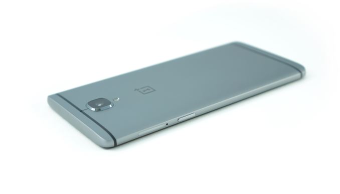
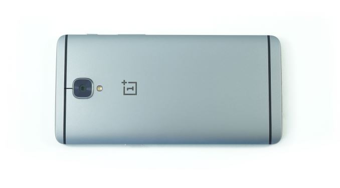
With the OnePlus 3, OnePlus has moved to an aluminum unibody design. In doing so they've addressed pretty much all of my issues with the OnePlus 2. Starting with the back of the device, you no longer have the sandstone finish. I'm sure many people will disagree, but the OnePlus 2 back cover didn't help me with gripping the phone at all. The OnePlus 3 feels like a much higher quality device, particularly because there are no longer three distinct sections of the phone that all have seams and gaps between one another. The unibody design means the back cover is no longer removable, but as I said in my OnePlus 2 review I think the removable back cover on OnePlus devices was a complete waste anyway because it only served as a way to access the SIM slots, which could have been implemented as a tray on the side of the device. With the OnePlus 3 they've done exactly that, and so the removable back cover isn't needed.
The back cover sees some additional changes, with some being independent of the move to an aluminum chassis. There are now lines for the antennas on the top and bottom of the phone, and the top line connects to the square-shaped camera sitting beneath it, which reminds me of the HTC One M9. On the topic of the camera, there's no longer a separate island that the camera and flash sit upon, which I think is a big improvement on what I felt was one of the least appealing visual aspects of the previous OnePlus devices. The camera does stick out significantly more than it did on the OnePlus 2 which is just a consequence of the significant reduction in thickness, and OnePlus has actually decreased sensor size with this generation so the hump likely would have been even larger if they hadn't. The only other thing to note about the camera area is that there's now just a single LED flash and the camera uses PDAF, while the OnePlus 2 had a dual LED module and an IR module for the laser autofocus.
On the left side of the phone you have the volume rocker and the mute switch, while the right side has the sleep/wake button and the NanoSIM slots. I appreciate that OnePlus has kept their volume rocker on the left side of the phone, and I think the three stage mute switch is an underappreciated feature that more manufacturers should adopt. You can see above that the phone's edges only curve to a point, at which point you have a chamfered edge that meets the display glass. I like the appearance that this provides, but it does mean that you don't have the same smooth feeling when swiping near the edges of the display that you get on a device like the iPhone 6s Plus.
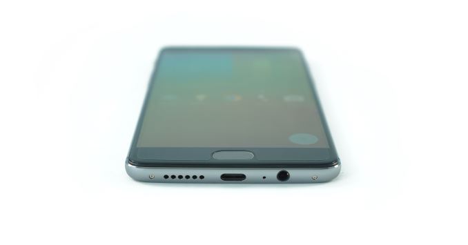
The bottom of the phone is changed from the OnePlus 2. There are no longer any antenna lines since they wrap around the left and right sides of the phone, and there aren't holes drilled on both sides of the USB Type-C port which has allowed the 3.5mm audio jack to be brought to the bottom of the phone. One thing that bothers me is how the 3.5mm jack isn't centered like the rest of the ports and screws, which kind of ruins the visual uniformity. You can also see OnePlus's pre-applied screen protector in the image above. It doesn't quite cover the entire display from edge to edge, and I noticed that a great deal of dust was collecting around the edges so I ended up removing it. It's just your typical plastic screen protector rather than a glass one anyway, although the fact that OnePlus throws it in for free is a nice gesture.
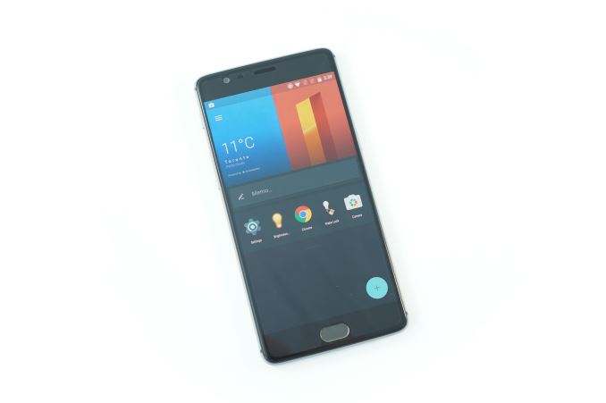
The front of the phone is similar to the OnePlus 2, but it's clear how the overall shape of the phone has changed to become more curved, while the OnePlus 2 was similar to the Nexus 5 in how it had flat sides meeting curved ones at hard angles. I have to say that I prefer the appearance of the OnePlus 3 in this regard, but it may be seen as less unique than the OnePlus 2. As for what's on the front cover, you have the earpiece and front-facing camera on the top, with three capacitive keys on the bottom. The middle key is the home button, which also acts as a fingerprint scanner in the same manner as the OnePlus 2's home key. In my experience the sensor has been quite accurate and just as quick as anything else on the market, and having it on the front of the device provides a better experience than rear-mounted scanners.
OxygenOS provides many ways to customize the phone, so you also have the option to switch the order of the back and recent apps buttons, and if you want software keys OnePlus provides that as an option as well. I covered the major points of OxygenOS in my OnePlus 2 review, and I haven't seen any major changes to it so I'll just refer to that rather than going over the features a second time. The one thing that has changed is that the UI no longer feels unbearably slow and sluggish, and in the next section you'll see exactly why that is.


176 Comments
View All Comments
Buk Lau - Wednesday, June 22, 2016 - link
You are missing one important factor, Samsung gave out an sRGB option out of the box in their settings. They didn't tell you, and they don't necessarily have to tell you just like how they don't have to tell you that you can uninstall/disable 80% of the junk that came with TouchWiz. However, it is an option that came by default, while I agree it is bs for not actively notifying the user of it, you can still turn it on. More importantly, if you are reading AT's review, then you know what they are using right? So if you read their review and learned that they claim the display is good, you should have already known what settings they are using to get those metrics. So no, AT doesn't have to test the default option if AT tells you that they are using sRGB mode. You as the reader should have known after reading the review, just like when you look at any data you have to first understand how the test is setup. If they don't tell you that, then that's their problem. 1+ straight up had no other options, and the problem itself may not be even fixable with a software update, that's the differenceKepe - Monday, June 20, 2016 - link
The difference between other reviews and this one is that the others just look at some pictures on the screen and then write that the colors are very vivid and bright and they "pop". Anandtech measures the picture quality using proper tools instead of just looking at the screen with the naked eye and then saying something vague and subjective. And I'm glad they do, because I don't want a phone that skews colors on the screen. I do more image editing on my phone than on my computer. If the screen is inaccurate, the pictures will look very wrong to others when they look at them on their phones.zodiacfml - Tuesday, June 21, 2016 - link
Right. I have a Nexus 5 and the grays just pop out because of quality.Now though, I'm itching for Samsung's displays as it will give the best contrast and best late night viewing.
ssiu - Monday, June 20, 2016 - link
Nobody here interested in Daydream VR? I may not want to shell out hundreds for "is it just a gimmick" VR but I want my next phone upgrade to be Daydream VR compatible, I'll pay ~$100 incremental cost for a VR headset.I believe ZTE Axon 7 is a "flagship spec at midrange price" phone that is Daydream compatible and "coming soon".
tipoo - Monday, June 20, 2016 - link
I wonder if Daydream solves positional drift though. Since smartphones have no fixed reference points for VR, they were just approximating movement with the accelerometer and gyro, leading it to "drift" from your heads actual position. I hoped Daydream would solve that, but it seems the headset adds no extra sensors and is still a fancier "dumb" headset like Cardboard.dezonio2 - Monday, June 20, 2016 - link
I don't really care about Daydream, but ZTE Axon 7 seems to address all the shortcomings of the One+ 3.5.5" 1440p AMOLED (hopefully more accurate) and SD card slot seem like benefits worth paying the extra $50 for. And personally I'd rather see the review for the Axon 7 than the HTC 10 or the part 2 for the S7. Or even the GTX 1080. (runs away from the angry mob)
Eden-K121D - Monday, June 20, 2016 - link
Galaxy S7 review not out yet sometimes Anandtech is too lethargiccoder111 - Monday, June 20, 2016 - link
Just for a record- OnePlus has TERRIBLE CUSTOMER SUPPORT.DO NOT BUY if you want to receive decent warranty service.
I have a broken OnePlus2 which I have sent to service center twice. First time they sent it back without any repairs. Second time it took 10 days just to get the shipping label to send it to a different repair center. It has been there for 2 weeks now without any notice of what's going on or if I'll get my phone back in working order or when.
In between all this it takes a long time to get response from the customer support team. They often copy-paste canned responses without even reading what I have said in my ticket. There is now way to call someone and talk in person or at least have an on-line chat- everything is a ticket system where getting a response takes a day or several.
In short, my phone has been broken for 2 months, OnePlus is still to repair it or to send a replacement. I want my money back for experience like this.
fanofanand - Monday, June 20, 2016 - link
This post reflects reasons #1, 2 and 3 why I will not consider a OnePlus device. The cost savings aren't worth it when the customer service is similar to what you would experience with an eBay purchase. This isn't an isolated experience, forums are filled with angry customers who have non-functioning phones and OnePlus ignores the situation.zodiacfml - Monday, June 20, 2016 - link
Not interested. Waste of $400. I Can't wait for the Nexus.